

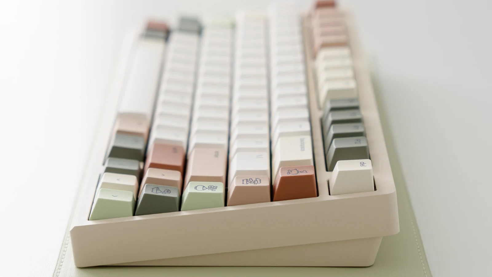
A calm desk is not simply a beige desk. The setups that feel restful usually have a clear visual hierarchy: one quiet base, a few repeated accent colors, and enough contrast to keep the keyboard usable. Osume’s Zen keycaps are a useful example because the palette assigns each color a job instead of treating every key as decoration.
The set combines cozy white, ivory sand, peachy clay, warm terra, mint jade, dusky pine, and sesame black. That sounds like a lot of colors, yet the result stays controlled. Most of the board is light and low contrast; clay and green appear in smaller blocks; dark legends and modifiers keep the layout from dissolving into one pale surface.
Why the palette feels calm instead of flat
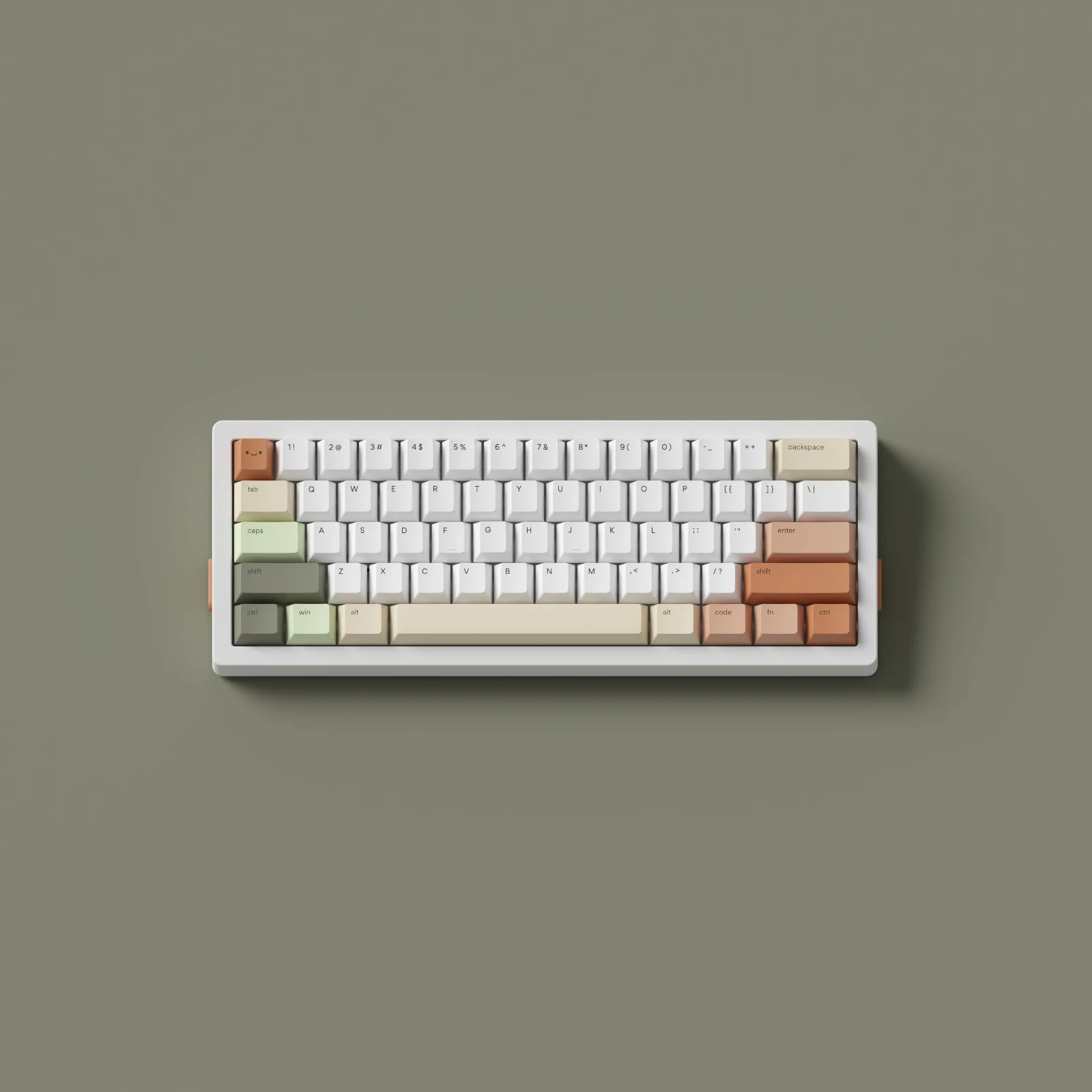
The largest color areas are warm off-whites rather than pure white. That reduces the hard edge between the keyboard and common desk materials such as oak, walnut, cork, cream felt, or natural linen. The darker green and black keys then act as anchors. Your eye can find the outside keys and main groups without every row demanding attention.
Peachy clay and warm terra do something different: they stop the green-and-cream combination from looking clinical. A small amount of warm color makes a setup feel lived in. The useful lesson is proportion. If every accessory repeats the clay color at full strength, the calm effect disappears. One notebook, cable, coaster, or lamp detail is enough.
This is also why the set can work beyond a perfectly styled product photo. The palette has light, middle, and dark values. Even if your monitor, case, or desk is a different color, there is usually one part of the keycap set that can visually connect to it.
Start with the keyboard case, not the accessories
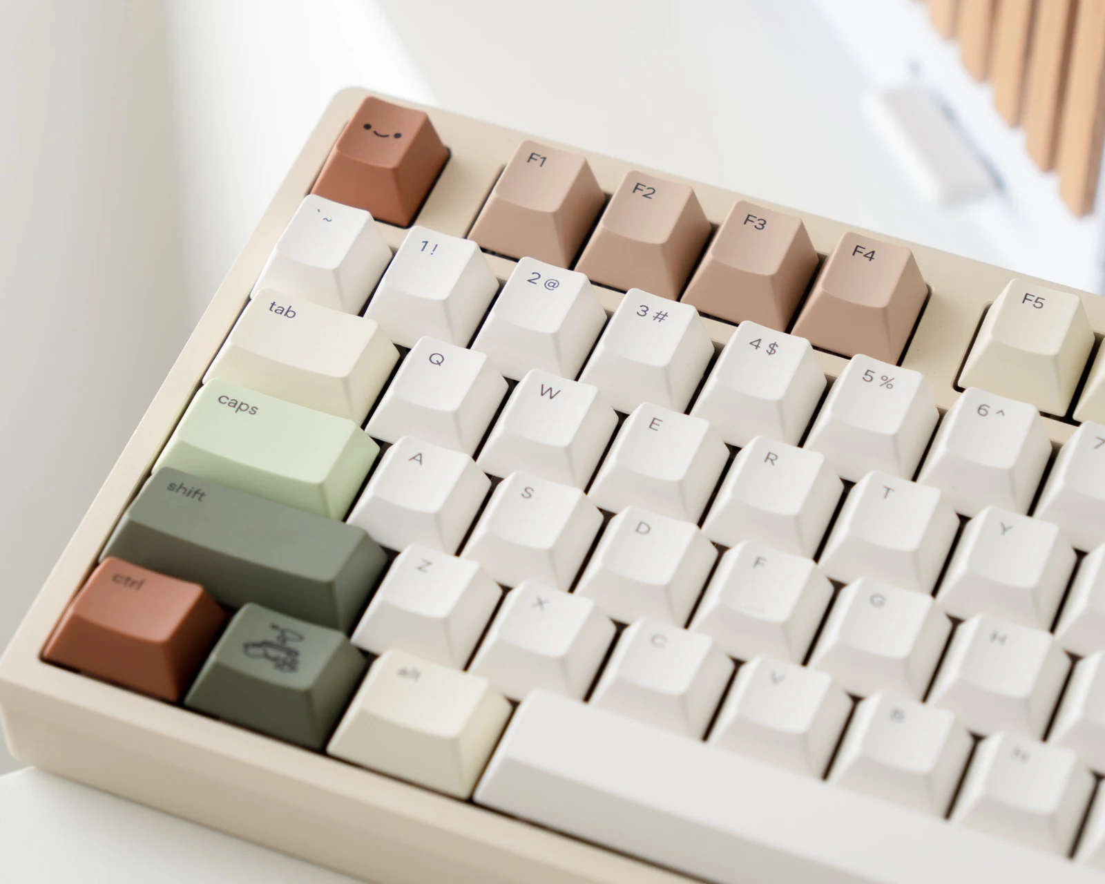
On a cream, beige, champagne, or light-wood case, Zen reads as one continuous warm composition. On a white case, the off-white keys add enough variation to prevent the board from looking unfinished. A dark gray or black case creates a sharper frame around the palette; that version feels more graphic and less cottage-like, but the darker modifiers help it make sense.
A saturated case is harder. Bright blue, red, or purple introduces a second dominant palette. It can still work, but the desk will no longer feel especially quiet. If you already own a colorful board, place the keycaps against a photo of the exact case before buying. Product renders on a neutral background hide color conflicts that become obvious on a real keyboard.
Repeat materials before repeating colors
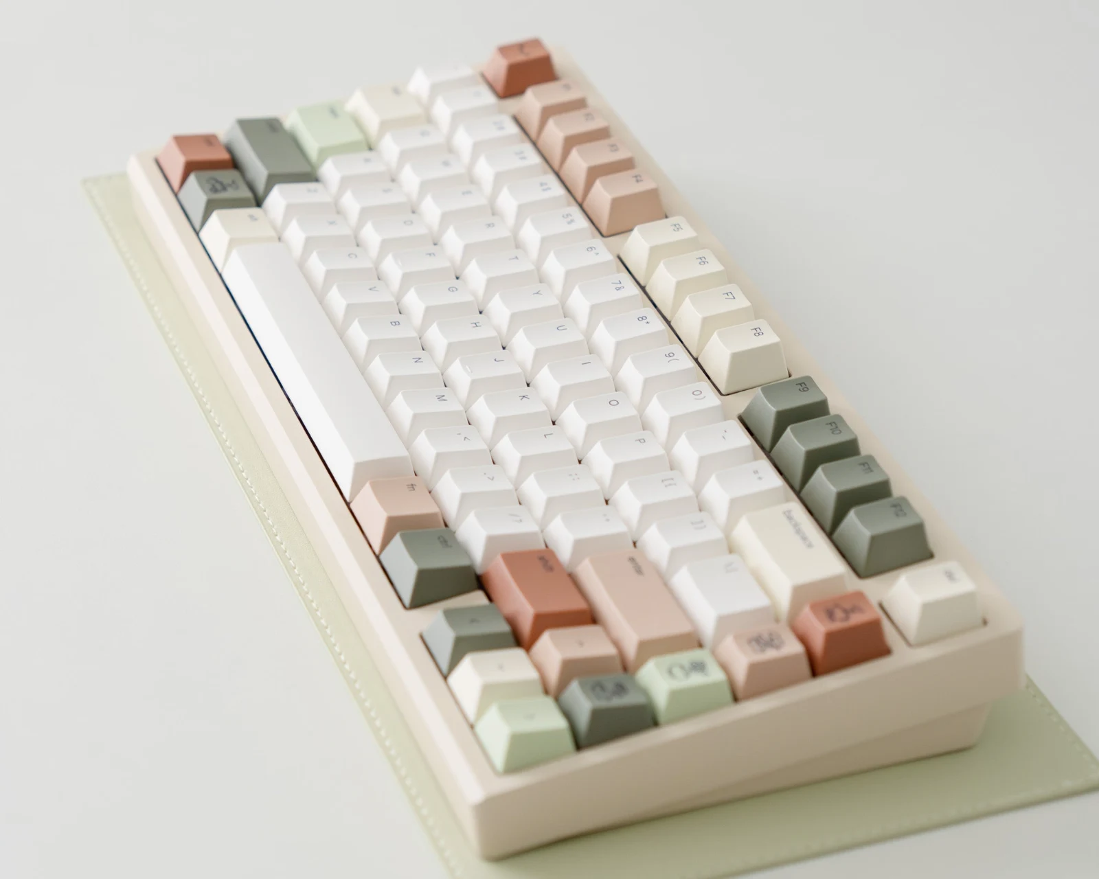
The fastest way to make an earthy keyboard look forced is to buy five green objects to match it. A better approach is to repeat texture: a matte monitor stand, woven desk mat, uncoated ceramic cup, wood tray, or paper notebook. These materials share the same visual softness without copying the keycaps color for color.
For metal accessories, brushed silver and warm gray stay quiet. Glossy chrome reflects more light and can become the brightest object on the desk. Matte black works when you want structure around the pale palette, especially with a dark monitor arm or black display bezel.
Lighting changes the palette too. A warm lamp emphasizes the clay and cream tones; cool daylight makes mint and pine more prominent. Neither is wrong. What matters is checking the set under the light you actually use instead of judging it only from a studio render.
Use novelty keys as punctuation
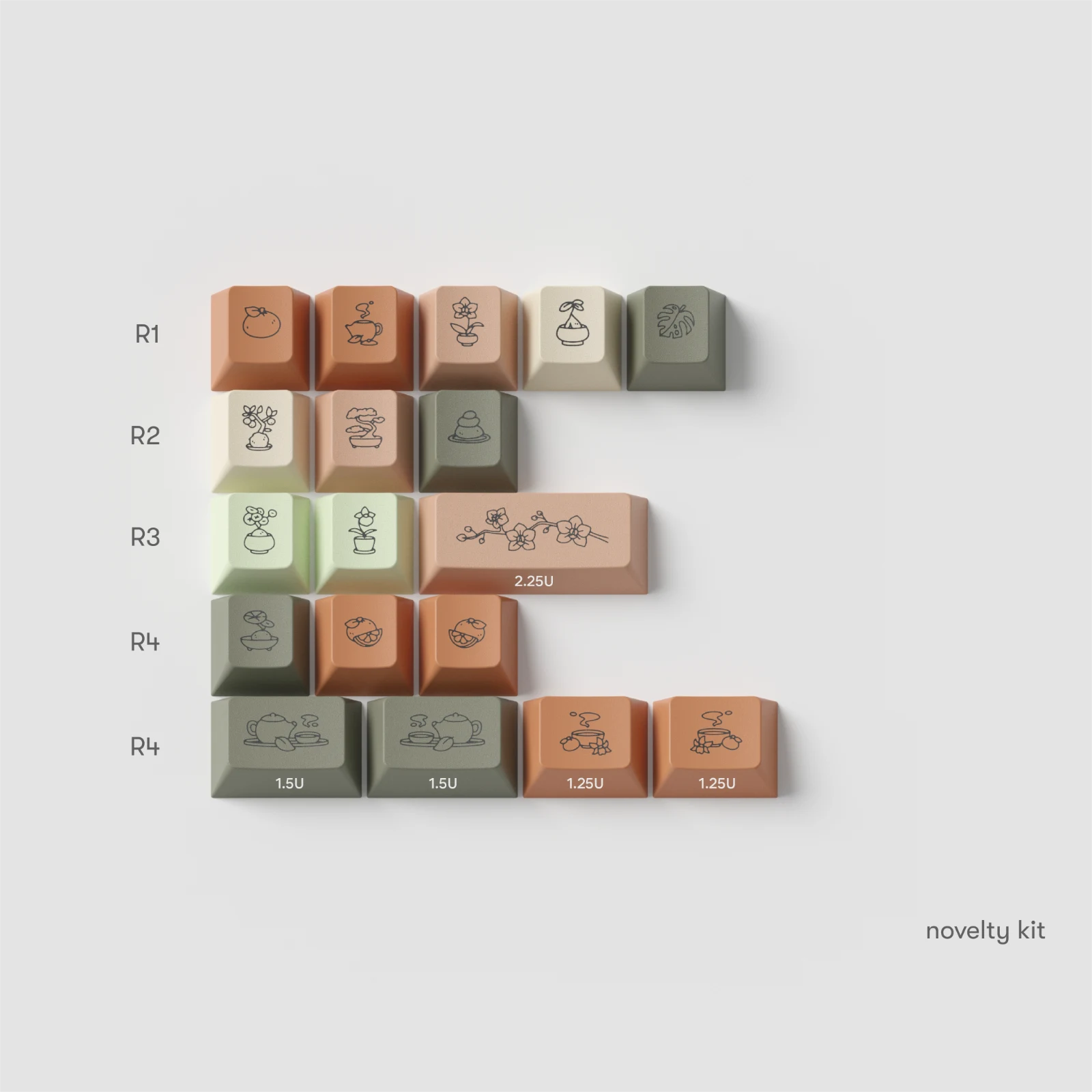
The Zen novelty kit adds plants, tea, and small decor illustrations. The obvious temptation is to use every novelty that fits. That makes the board busier and weakens the effect of each drawing. Choose two or three places the eye naturally lands: Escape, Enter, one corner modifier, or a small navigation cluster.
Spacing matters. One illustrated key in each corner creates a deliberate rhythm. Five adjacent novelty keys look more like a sample tray. If your desk already contains botanical art or several small figures, use fewer novelty keys and let the color palette do the work.
Check the kit before falling for the mood
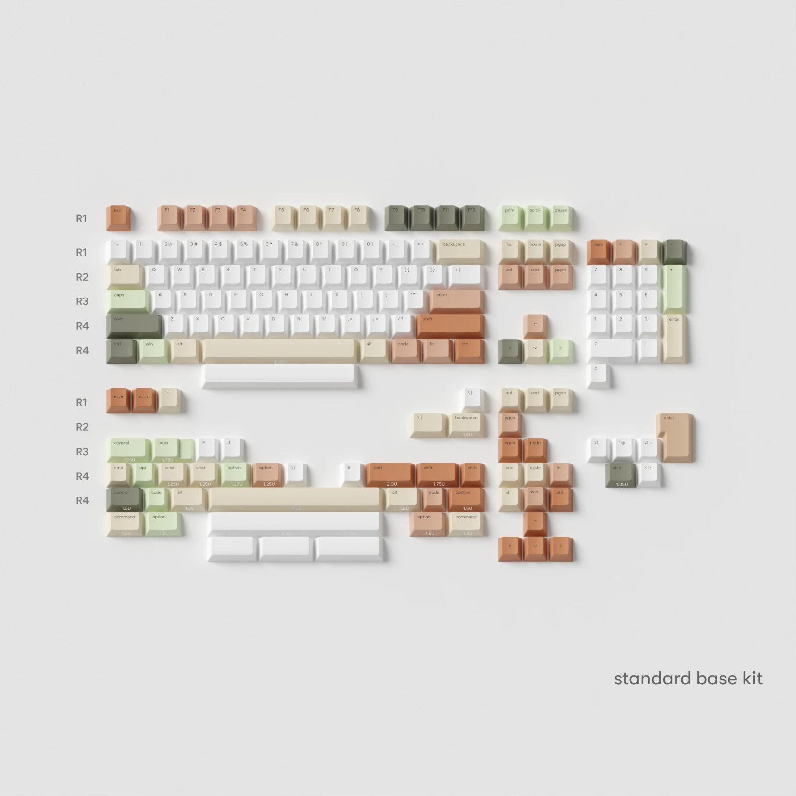
Osume lists the Zen set as Cherry profile, 1.6 mm PBT, and dye-sublimated. The product page lists support for common full-size, TKL, 75%, 70%, 65%, 60%, and some 40% boards, with ANSI, ISO, HHKB, Tsangan, 1800, Mac, and Alice support. That is broad coverage, but “compatible” still depends on the exact key sizes your board uses.
Compare the base kit image with your current layout. Pay particular attention to the right Shift, bottom-row modifiers, spacebar, Enter key, and any split keys. A 75% keyboard can look standard at a glance and still use an unusual right-side column. Our keycap compatibility chart guide shows how to read those sizes before ordering.
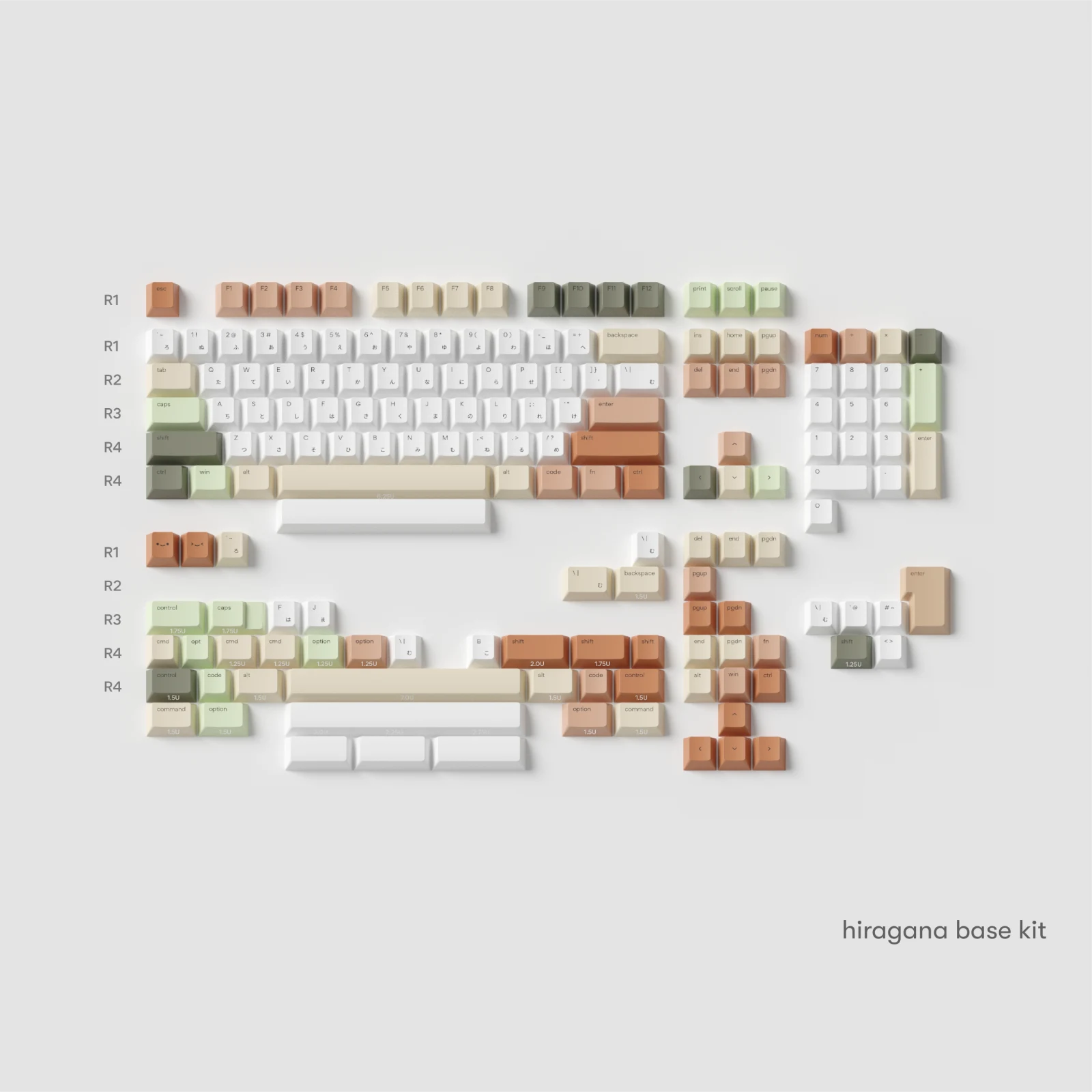
The standard and Hiragana versions produce different moods even though the colors are the same. Standard legends keep the board quieter. Hiragana sublegends add texture and a busier rhythm across the alpha keys. Choose based on how much detail you want to see every day, rather than treating the sublegends as a free decorative upgrade.
At the time we checked on September 18, 2026, osume listed both base-kit versions at $95 and available. Stock and options can change, so use the official product page for the current position.
How to build the same feeling with a different set
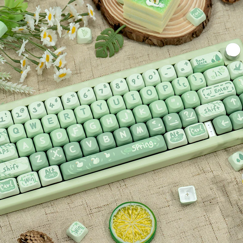
You do not need this exact set to build a calm desk. The reusable formula is a warm neutral base, one darker grounding color, and one restrained accent. Our Matcha Green Spring Outing MOA set uses a similar green-and-cream relationship but feels softer and more playful because of its rounded profile and illustrated details.
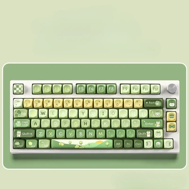
The Matcha Rabbit SOA set goes further toward a cute desk. It keeps the pastel green anchor but makes the characters part of the main visual story. That is a useful comparison: a calm palette can support either minimalism or illustration. The difference is how much detail you allow to become the focal point.
The design lesson worth borrowing
Zen works because it gives the eye somewhere to rest. The neutral keys occupy the most space, the dark colors define structure, and the warmer accents keep the arrangement from feeling sterile. The illustrations remain optional punctuation instead of taking over every key.
When you plan your own desk, choose one element to lead. If the keycaps lead, let the mat, cable, lighting, and accessories support their palette with quieter materials. That creates a desk that feels considered without looking like every object came from the same themed bundle.
Source note: product specifications, kit layouts, price, availability, and osume images were checked on the official Zen product page and the September 17 release announcement on September 18, 2026.