

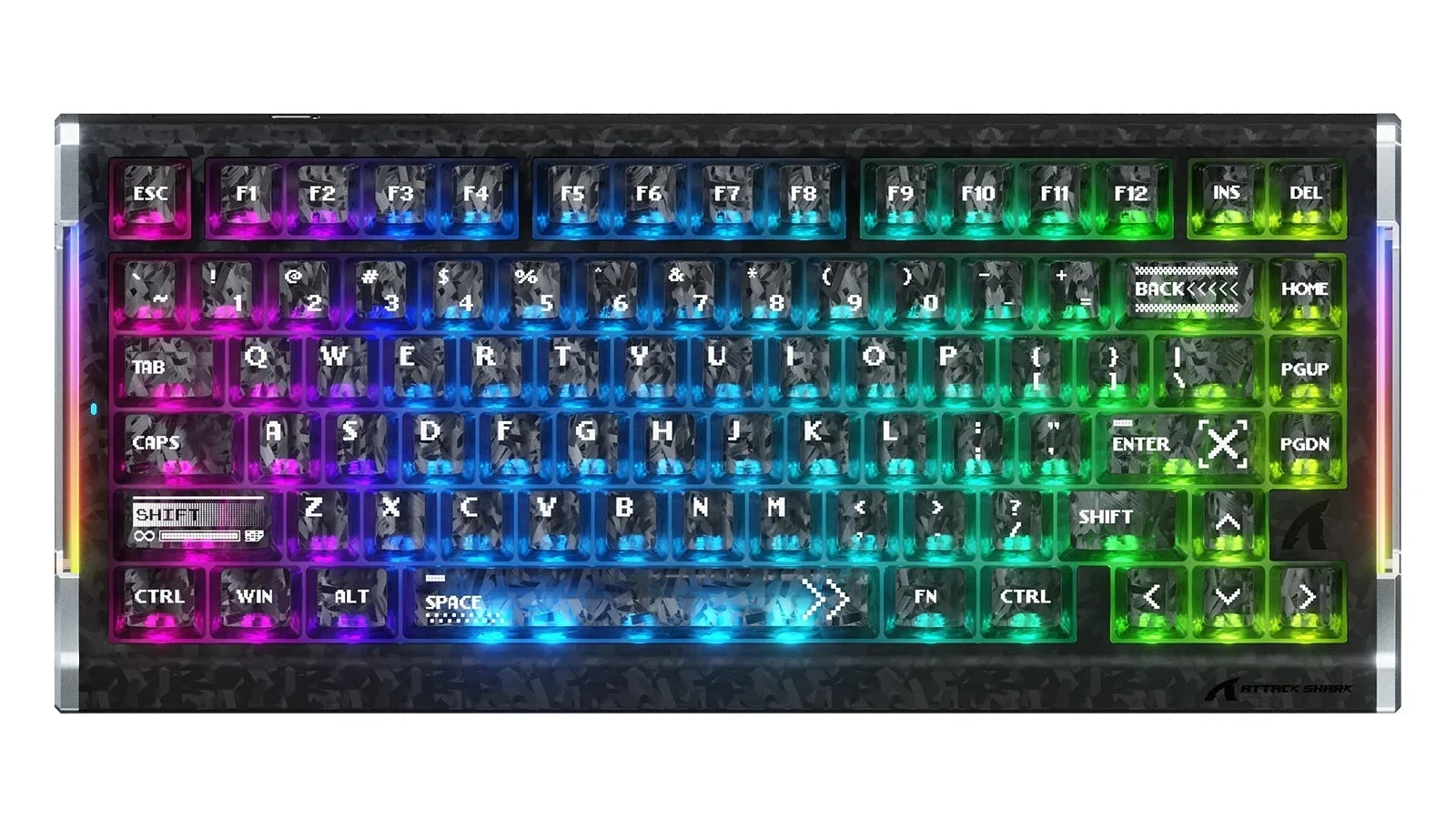
The most interesting thing about ATTACK SHARK’s R86 HE is not another number on its gaming spec sheet. It is the way a familiar black keyboard stops looking like a flat slab. The patterned surfaces catch the eye even before you notice the lighting.
For a desk makeover, that raises a better question than “Is carbon fiber premium?”: do you want a different material, a different look, or both? Those are three different reasons to buy. You can love this visual direction without needing to replace your entire keyboard.
The launch makes the material question worth asking
As checked on September 10, 2026, ATTACK SHARK’s official R86 HE page lists a September 21 launch and September 22 shipping start, both PDT. Its $2 offer is a reservation for a discount code—not a $2 keyboard.
The specification table separates the versions: Ice Ninja and Ink Shade are listed with forged carbon-fiber composite keycaps; Moonlight is listed with standard PBT keycaps. The top case is described separately as a carbon-fiber composite. That distinction matters: a carbon-fiber keyboard case does not establish what its keycaps are made from.
This is a design discussion based on the published information and images, not a hands-on review. We have not tested these keycaps or independently verified their composition.
Why the patterned black surface works
A plain black set gets its shape from the edges between keys. Add a broken, shard-like pattern and there is something to look at within each key as well. That is the appeal here: detail without needing a character illustration or a whole new color palette.
Our take is that this direction suits someone who finds an all-black desk a little lifeless but does not want a brightly illustrated keyboard. It adds movement while leaving the overall setup dark. Think of it as changing the texture of a jacket rather than changing its color.
There is a limit, though. A patterned case, patterned keycaps, bright legends, and rainbow lighting are all competing for attention. If you want the surface detail to be the point, start with restrained lighting and a simple desk mat. If your goal is an energetic gaming centerpiece, the busier combination may be exactly what you like. Neither is a performance advantage; they are different visual priorities.
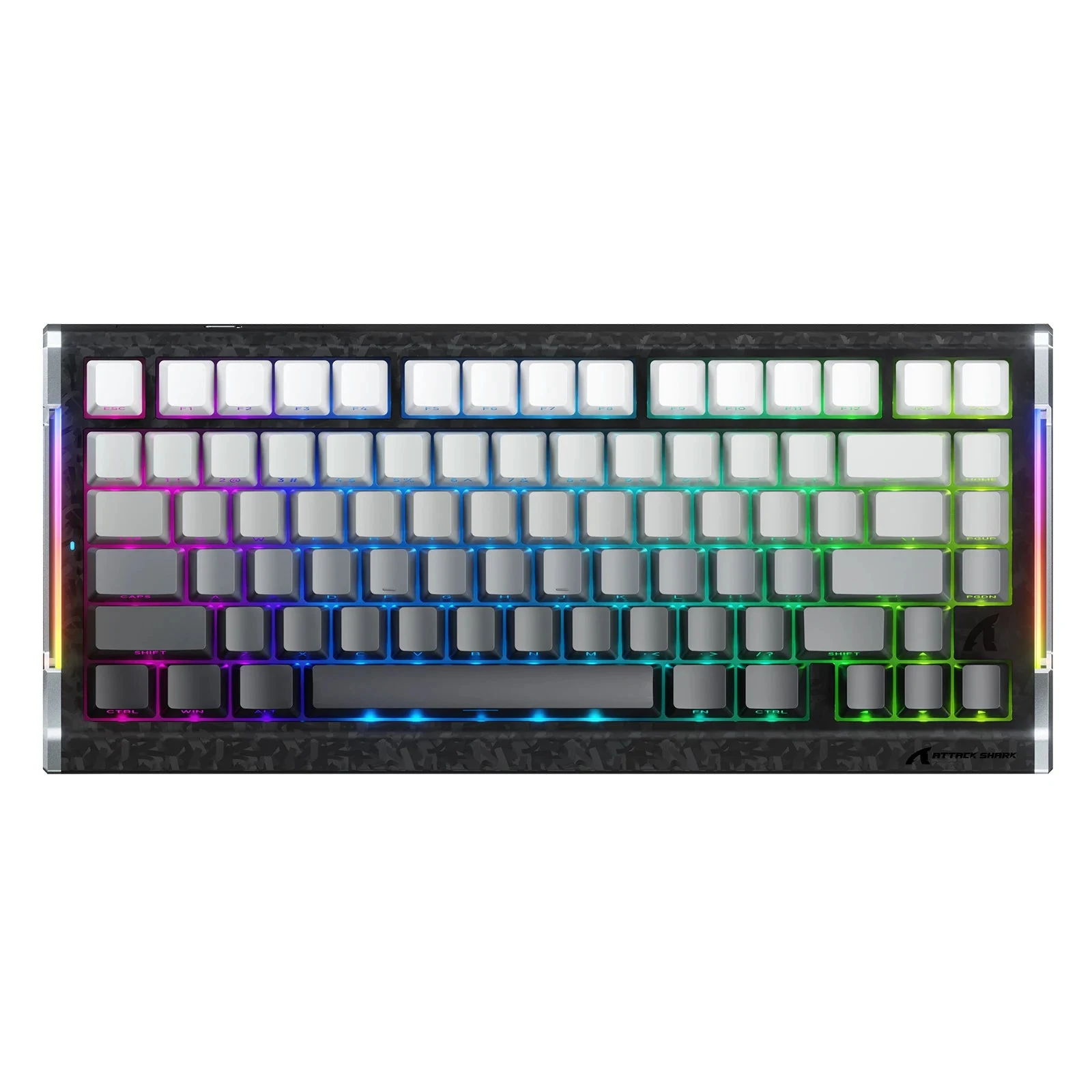
Plain keys can be the better partner for a patterned case
The contrast above is useful even if you never buy an R86 HE. You do not have to repeat a finish across every visible part of a keyboard. Plain key tops can give a busy case room to stand out; a plain case can do the same for patterned keycaps.
Try this with your current desk before shopping. Look at it from your normal seated position, not only from a close-up photo. Is the keyboard meant to blend with the monitor and mouse, or become the one object you notice first? A close-up can make subtle texture look dramatic, while a wide desk view may make it disappear.
Legends deserve the same treatment. Side-printed letters make the top of a keyboard look cleaner, but that only helps if you can comfortably read the letters from where you sit. A visual upgrade that makes everyday typing less pleasant is not much of an upgrade.
Material is not a shortcut to better sound or faster keys
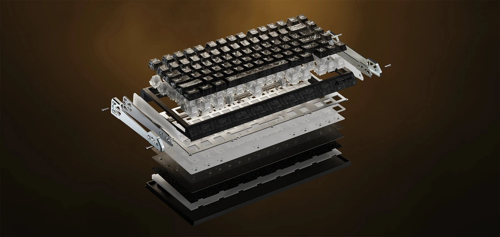
The exploded view is a good reminder that keycaps are one part of a larger assembly. A keycap material name cannot tell you how the complete keyboard will feel or sound on your desk. Thickness, profile, switches, the case, and the surface underneath it all complicate a simple material comparison.
Nor should a claim about a keyboard’s electronics become a claim about its keycaps. Swapping decorative caps onto your existing board does not add Hall-effect sensing or change its software features. Buy a different keyboard if you need different keyboard behavior. Buy caps if the part you want to change is the part you see and touch.
For ordinary plastic options, our ABS versus PBT guide explains why finish and construction deserve attention alongside the label.
If you want the look on the keyboard you already own
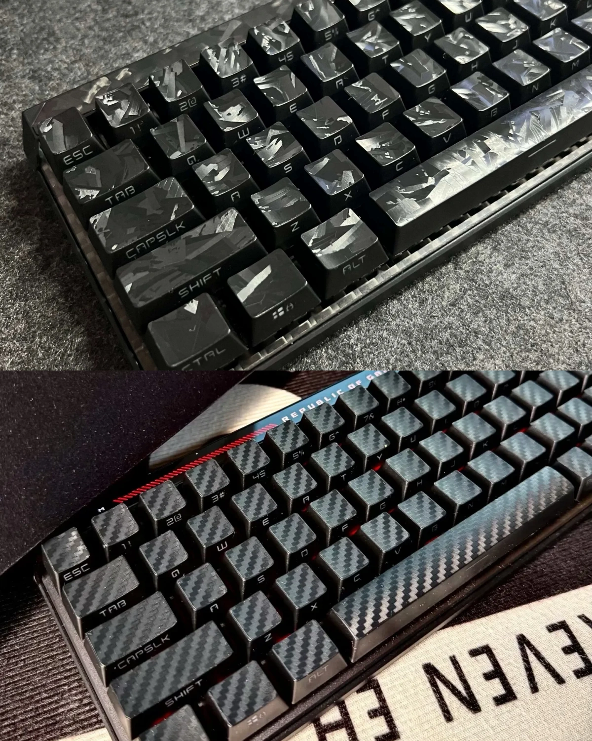
Our Forged Black Carbon Fiber OEM Keycap Set takes the appearance route. Despite the product name, the listing specifies PBT with a carbon-inspired finish, not a machined real-carbon keycap set. It should not be treated as the same material as ATTACK SHARK’s advertised composite caps.
What it offers visually is easier to judge: a dark patterned top and side-printed legends. In the product photo, the irregular pattern reads more like scattered fragments, while the regular pattern reads more like woven fabric. Pick the option shown in the listing that you actually prefer; do not expect every variation to have the same finish.
This makes sense if you like your current switches and layout and only want a different surface treatment. It is not a substitute for someone collecting particular materials or looking for independently measured acoustic results.
The listing offers several layout kits. Check the actual included keys, especially the right Shift, bottom-row modifiers, and spacebar, rather than relying on key count alone. Our guide to reading a compatibility chart shows what to compare.
Our verdict: choose the visual effect before the material label
The R86 HE is worth paying attention to because it makes a dark keyboard visually interesting in a different way. But the useful lesson is not that everyone needs carbon fiber. It is that texture can carry a desk’s personality just as effectively as color.
If your keyboard already works the way you want, a well-chosen patterned set may be enough. If the material itself is what fascinates you, look for a clearly specified construction and credible hands-on evidence. And if the quieter Moonlight-style contrast appeals more than an all-over pattern, trust that preference. A setup you enjoy looking at matters more than winning an argument over which label sounds more expensive.